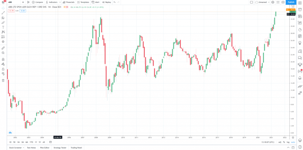
Candlestick charts are important tools for day trading. Traders use these charts to understand the markets and determine price movements based on patterns. The chart offers a great deal of useful information in an easy-to-read format.
Traders have been using candlestick charts for centuries. The candlestick chart was invented in the 1700s by a Japanese man exploring the relationship of supply and demand of rice prices.
If you are interested in becoming a better trader, then being able to read a candlestick chart will allow you to gain far more control and knowledge of shifting prices.
>> Looking for a broker? Check out Online Brokerage Reviews‘s roundup of brokers for CFDs, suitable trading platforms, guide for trading platforms in Singapore, recommendations for Forex Brokers here.
Here’s a quick guide on how to read candlesticks.
What A Candlestick Chart Shows
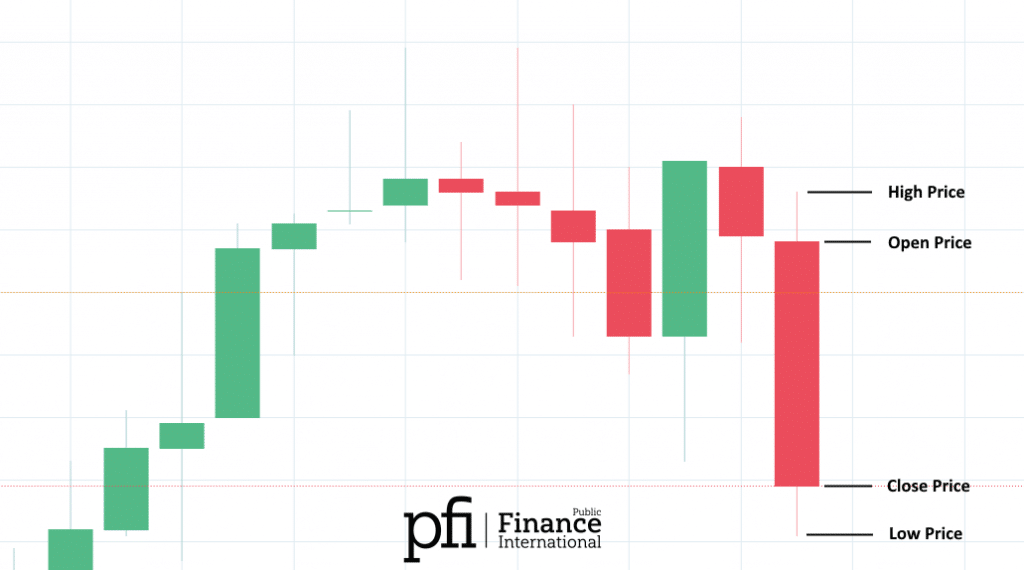
These charts consist of different candlesticks that portray the open, high, low, and close prices over a specific period.

The trader will set a time frame for the chart, and it will refresh over this time.
When reading a candlestick chart, you can track the current price as it is taking shape, and follow it across the price scale over your set time.
Open Price
The open price is shown on either the top or the bottom of the candlestick. This varies depending on how the price fluctuates over the timeframe of the chart.
If the price moves down, the open should be at the top of the candlestick. If the it rises, the open will be positioned at the bottom.
Low Price
The low price is seen at the bottom of the candlestick chart. A shadow is used to represent this.
High Price
The high price is indicated by a shadow on the top portion of the candlestick chart.
Close Price
The close price refers to the final price depicted on the candlestick chart before the chosen timeframe ends.
The price will continually move during the chart’s timeframe. If the close price drops below the open price, the candlestick will turn red.
If the price rises above the open, it will turn green.
Price Range
The price range of a candlestick chart is measured between the top of the upper shadow and the bottom of the lower shadow.
During the timeframe of the chart, the price will move between these points. When you figure out the range of the chart period, subtract the low from the high . You should follow the direction of the price as it moves within this range.
Green candlestick charts depict a higher closing than the opening. Red charts depict the price moving in a lower direction from its opening mark.
A candlestick pattern where the price will rise is called bullish. When the price is expected to decrease, the pattern is referred to as bearish.
Candlestick Charts and Bar Charts
Bar charts and candlestick charts represent the same information. However, candlestick charts use a more visual system of colors and shadows to provide more in-depth information. The colors change between red and green.
A candlestick chart uses shadows to represent the high and low points of the prices. These shadows are considered the wick of the candle and are positioned at the candle tips.
If the upper shadow is short on an up day, it shows that the closing price was close to the high point. If the top shadow on a down candle is short, it shows that price opened near the high point.
The shadows on a candlestick chart can be short or long, and they change each day. This representation is determined by the price when it opens and closes, and whether this is on the high or low mark.
Different Candlestick Patterns
A candlestick chart is created by the price moving up and down. The different direction of the price determines a certain pattern that traders follow to calculate their decisions.
Here are some variations of bullish and bearish patterns.
Bearish Engulfing
This occurs when there are more sellers than buyers. The pattern depicts a long red body taking over a small green body. Bearish engulfing patterns mean the price will likely start to drop.
Bullish Engulfing
This ha[pens when buyers are faster than sellers. The pattern shows a long green body taking over a smaller red body. Bullish engulfing could result in a rising price.
Bearish Evening Star
This is when the buyers stall and the sellers start to take over. A bearish evening start could result in increased sales.
Bearish Harami
This is when buyers are not acting and are being indecisive. Traders that spot a bearish harami don't need to act straight away, but they should monitor the patterns that follow. Upwards or downwards patterns can follow this.
Bullish Harami
A bullish harami means that a trend has paused or stopped.
Bearish Harami Cross
This is similar to a bearish harami, and it occurs when the open and close positions are basically the same.
Bullish Harami Cross
This results in the same implications of a bullish harami. The cross takes place during a downtrend.
Bullish Rising Three
This is when you have one long stable day, followed by three lowering price sessions. The trend ends with another long stable day. The pattern forms an “N” shape.
Bearish Falling Three
This is the same idea of a bullish rising three, except that the three sessions in the middle start low and increase – going from one sharp drop to a steady rise.
Conclusion
An essential part of being a trader is watching the markets and understanding their activities. You need to keep track of price movements to make smart judgments and properly informed trading moves.
This is why knowing how to read a candlestick chart is important. These charts allow traders to gain a thorough understanding of price patterns to make stronger predictions.
If you are interested in becoming an active trader, then you should follow candlestick charts for an insightful look into the continually moving price trends of a market.
